
UX/UI Design
Visual Language Strategy
Design Concept
My Role - Product Design
UX Research & Wireframing by Moti Sarig
Project Manage by Noam Kovalski
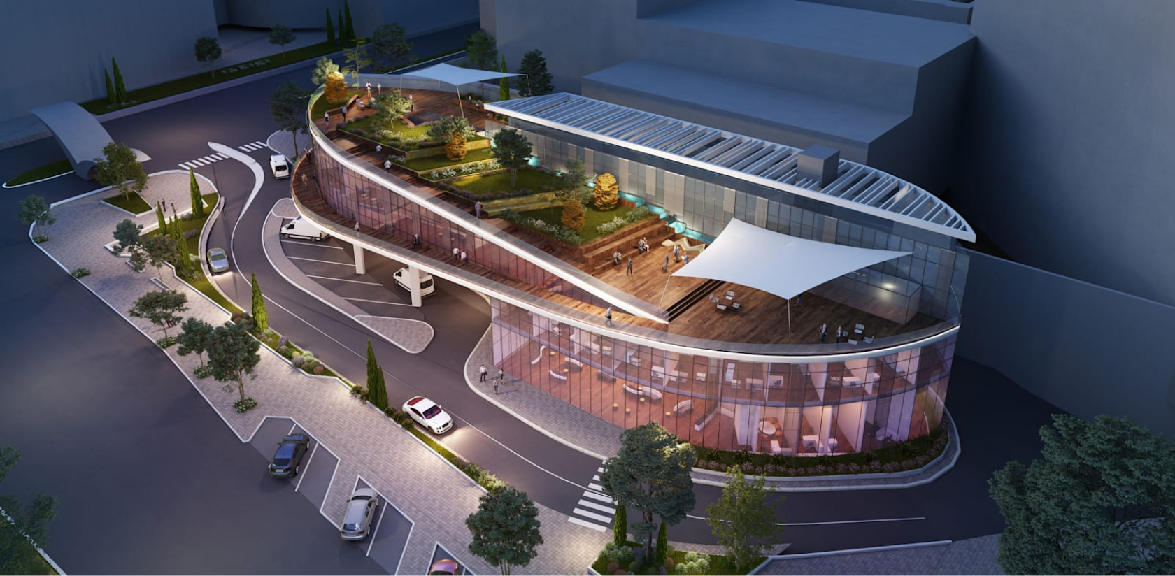
Ichilov Medical Center is one of the largest and most well-known in Israel, bringing together four leading hospitals and dozens of departments. The hospital serves nearly 4 million patients from across the country and employs thousands of professionals, including doctors, nurses, researchers, and hundreds of healthcare and administrative staff.
Currently, there are plans for several innovative and large-scale projects to expand the hospital's activities and service offerings, with a focus on providing advanced and innovative digital services.In recent years, the medical center has experienced extensive renovations and revitalization, aiming to enhance medical services and adapt to the continuous growth in the population.
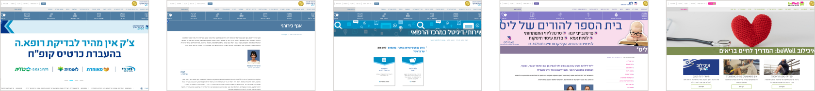
The current hospital website is outdated, cluttered, and challenging to navigate. The lack of a cohesive graphic language, heavy visual overload, and difficulty in consuming written information due to untreated typographic hierarchy make it a less user-friendly experience. The website does not effectively represent the Ichilov brand and fails to reflect the hospital's values of innovation and advancement.
Ichilov Old Website
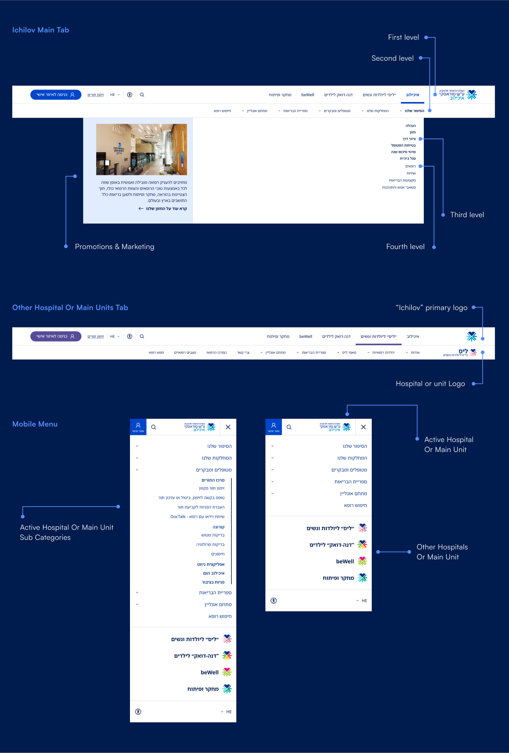
Remapping the information architecture in a way that will help users navigate the site easily and find the information they were looking for quickly and clearly.
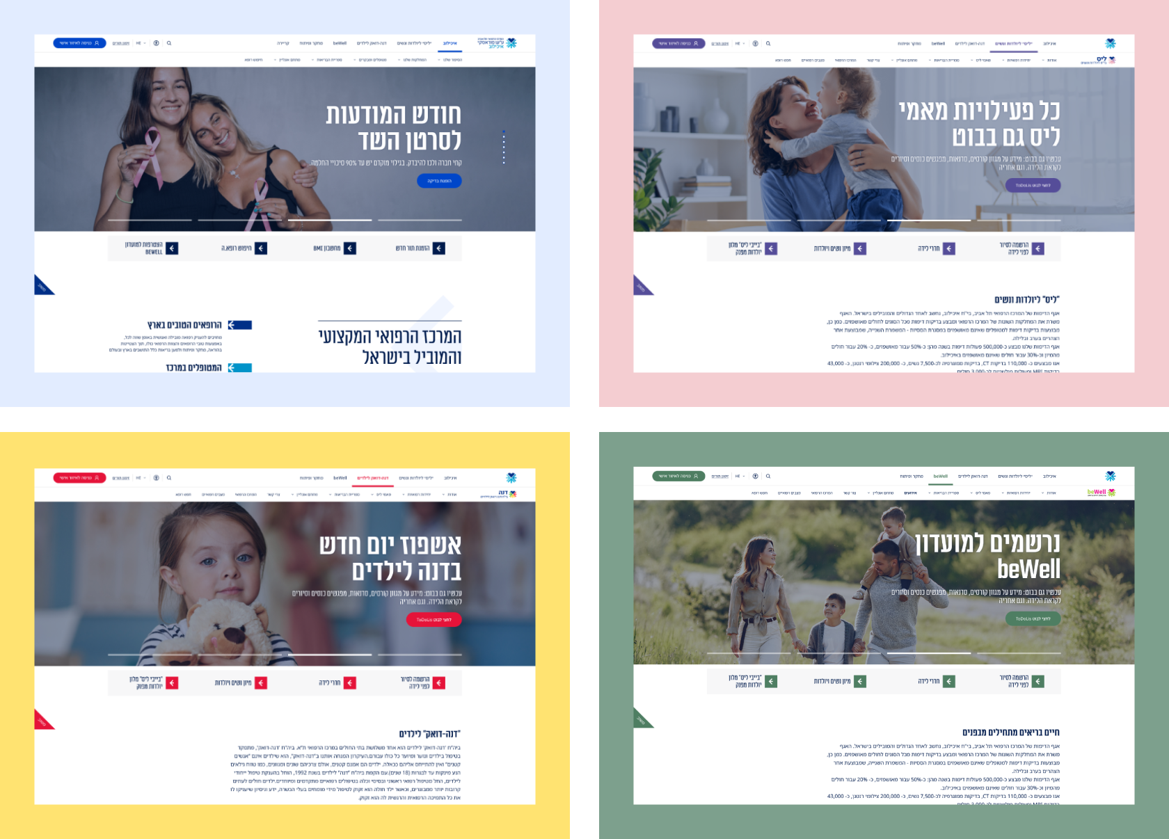
Emphasis on the central medical center which includes dedicated hospital units: Ichilov General Hospital, Lis Hospital for Maternity and Women, Dana-Duek Hospital for Children.
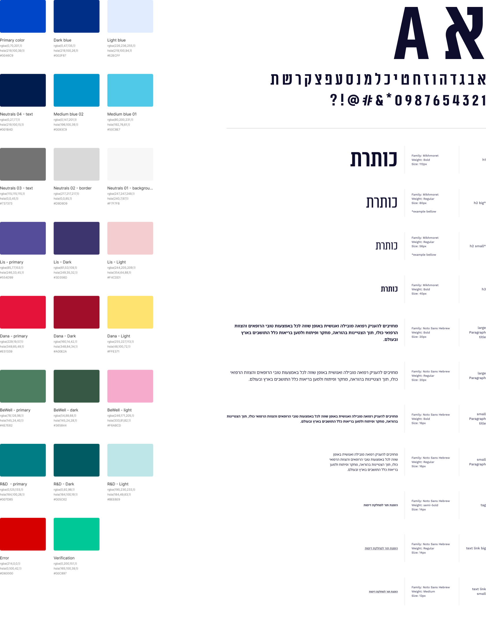
In terms of the graphic language, the hospital does not have an organized brand book and needs to reinvent the visual strategy that will lead the website and its digital assets.
Instructions from Ichilov's marketing team for initial stage of the new visual design concept:
"Cleanliness, clarity, simplicity. Large headlines with small sub-headings, meaningful use of typography, excessively large numbers in an exaggerated manner. Use of strong visuals and powerful images."
From these guidelines, we derived four guiding principles for the design concept:
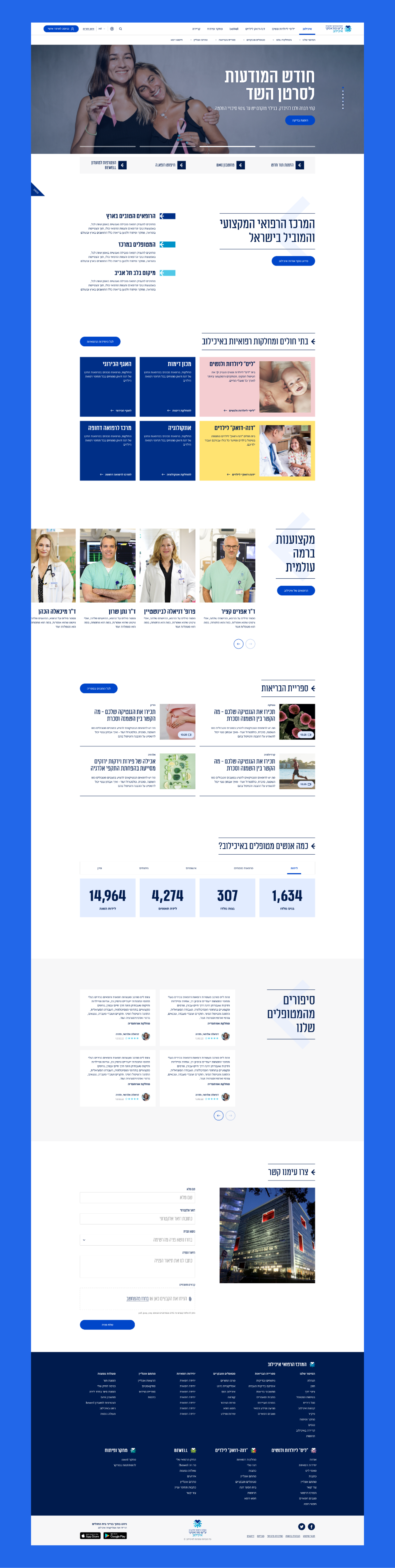
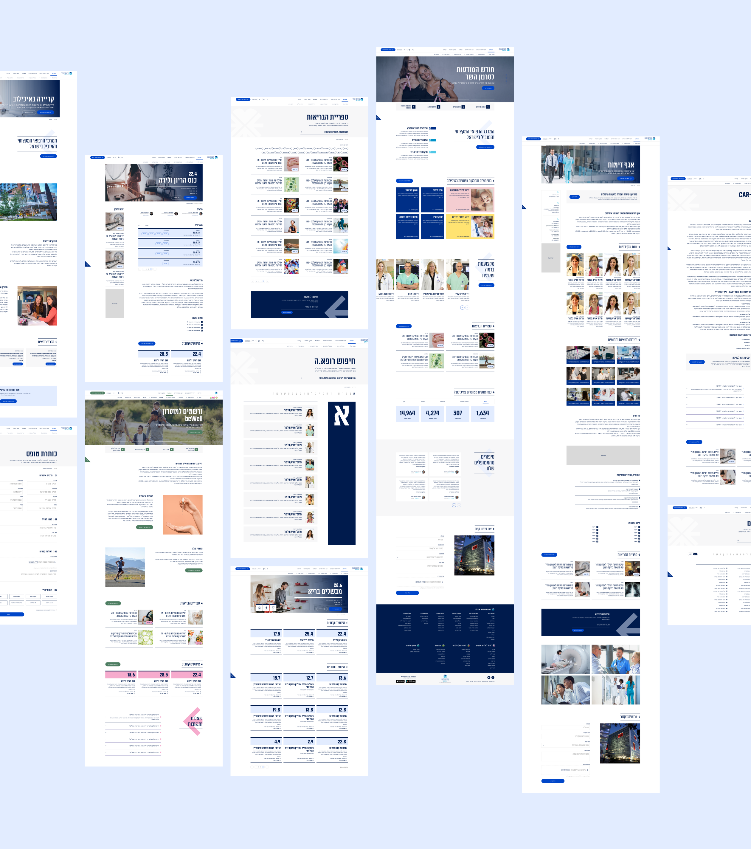
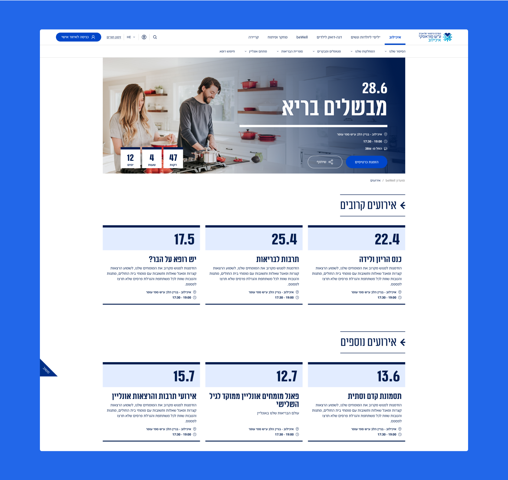
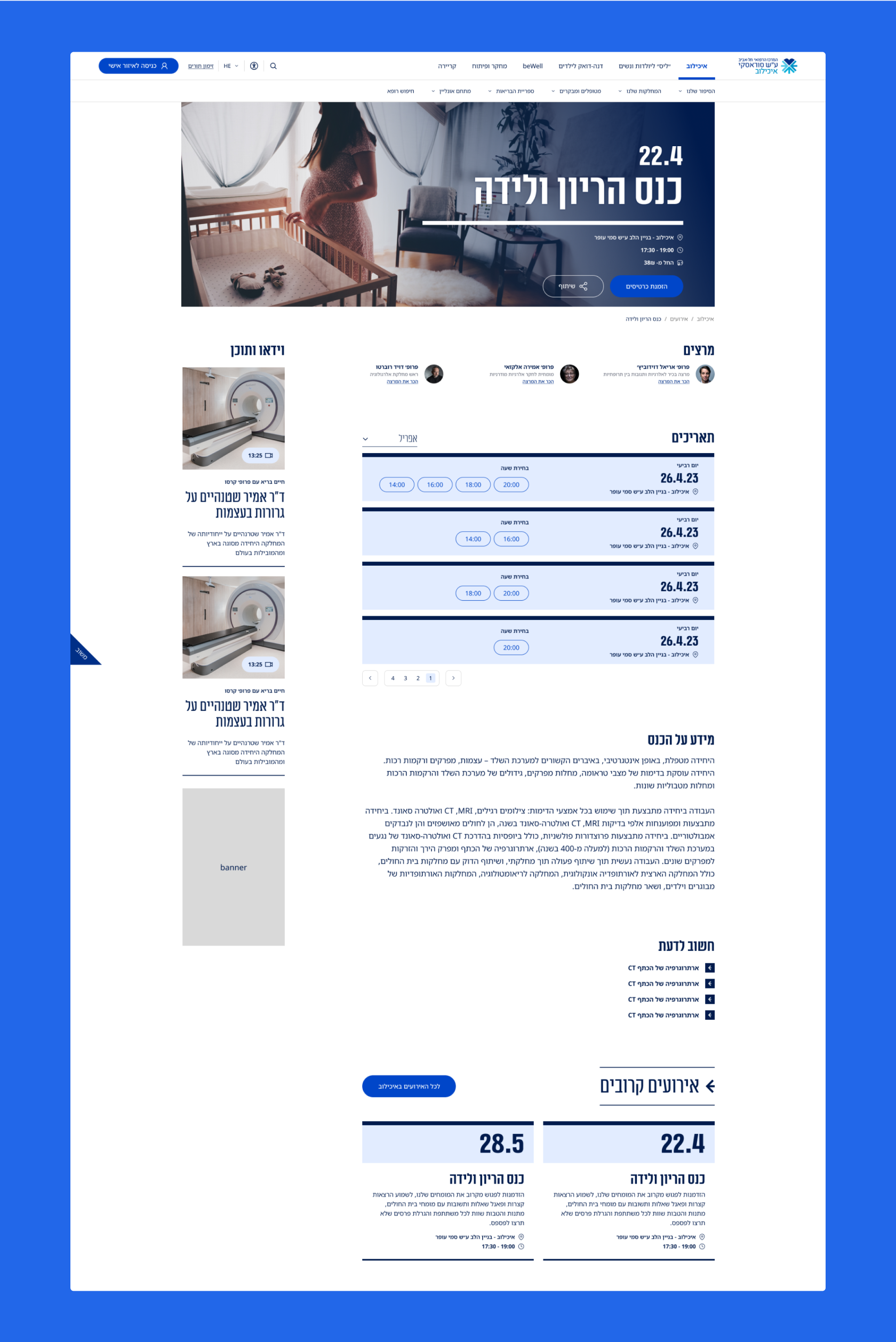
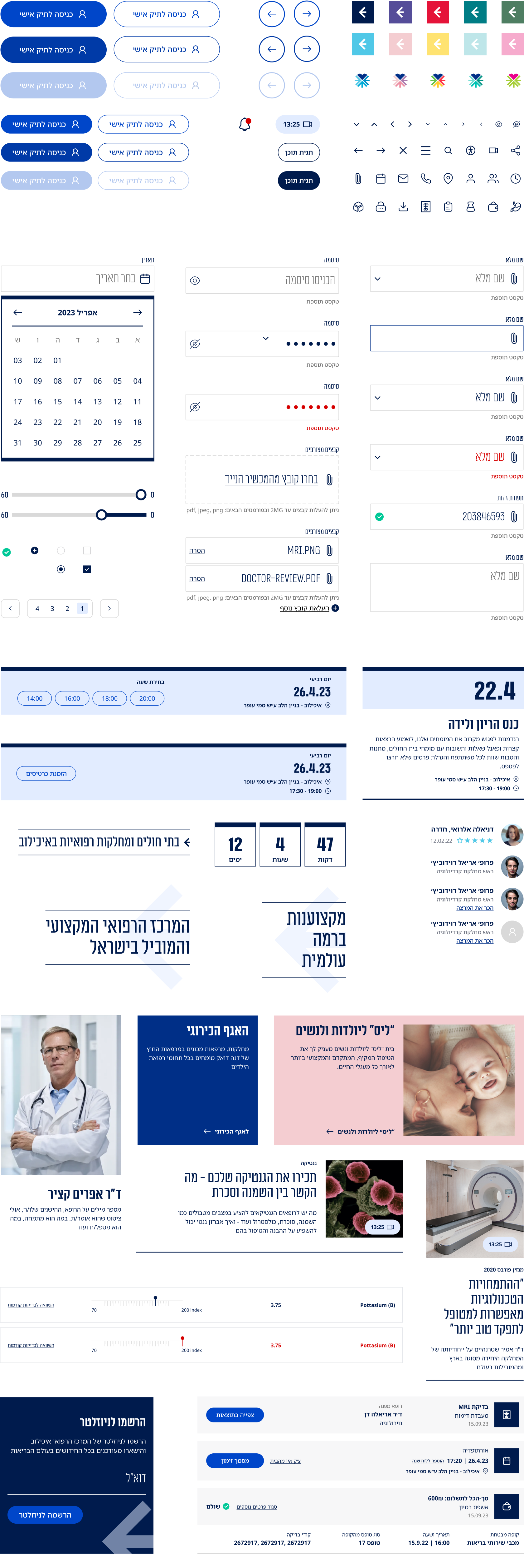
Homepage for Each Hospital Unit
Navigation & Menu System
Desktop Design
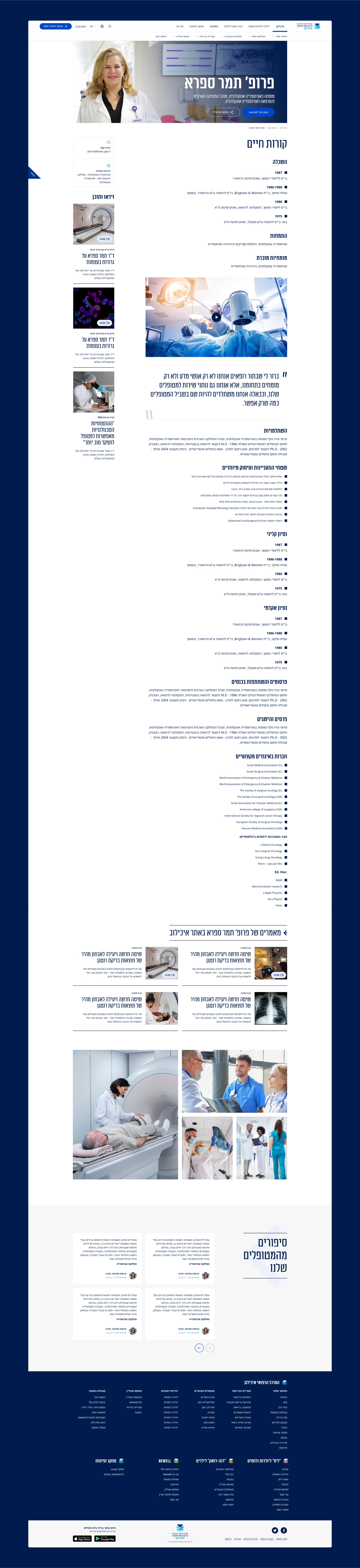
Doctors & Medical Staff Resume screen
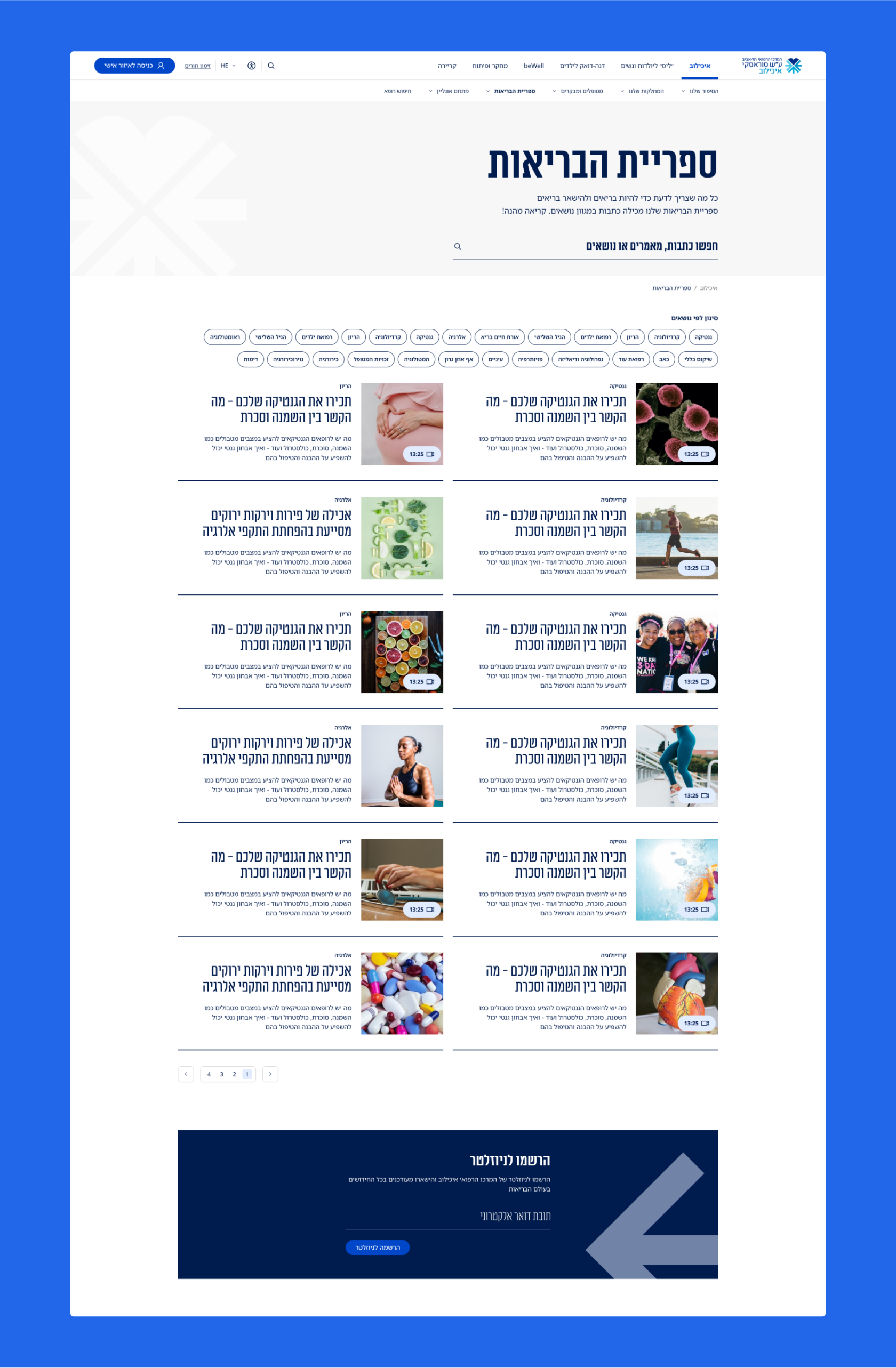
"The Health Library" - Medical Resource and Information
The hospital hosts workshops and lectures on medical topics, as well as training sessions on healthy lifestyles. In addition, there is an ongoing schedule of tours in various departments of the hospital. Therefore, there is a need for a page that consolidates all the events of the medical center, with the option to register for lectures and tour dates.
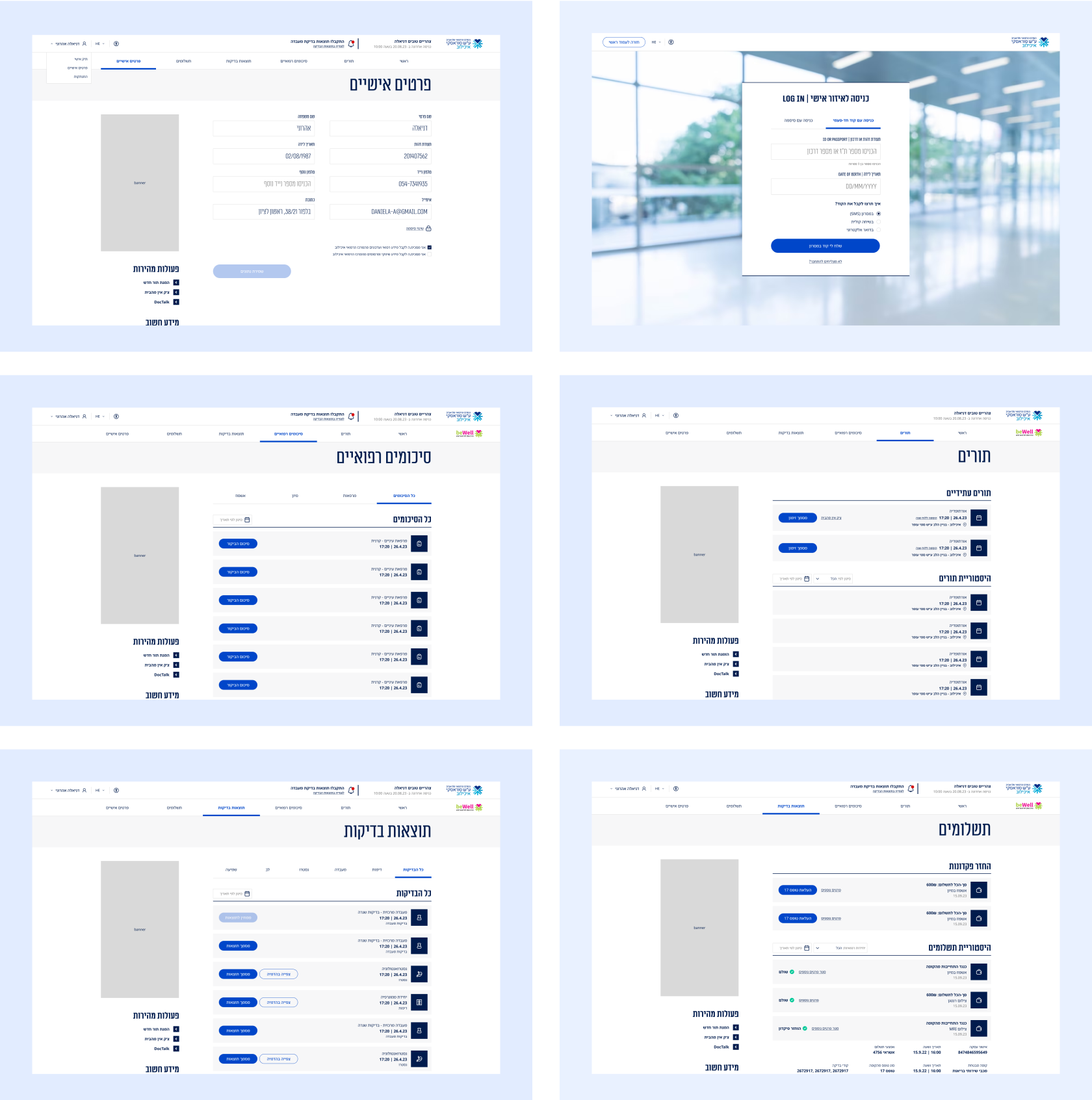
The Account and profile section is designed to facilitate patients of the hospital in obtaining information about the tests they have taken, medical summaries, Payments and test results, as well as to view upcoming appointments.
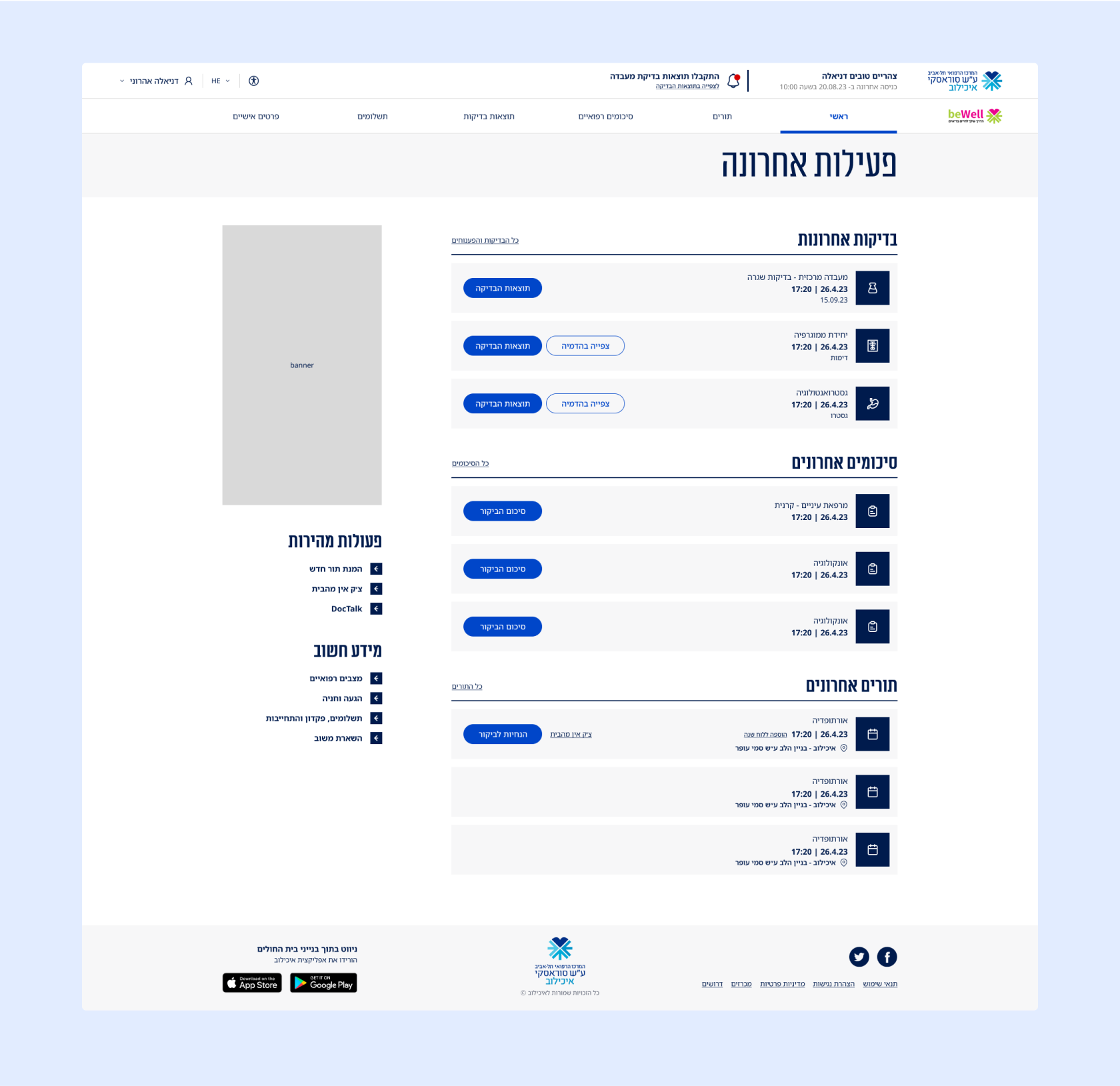
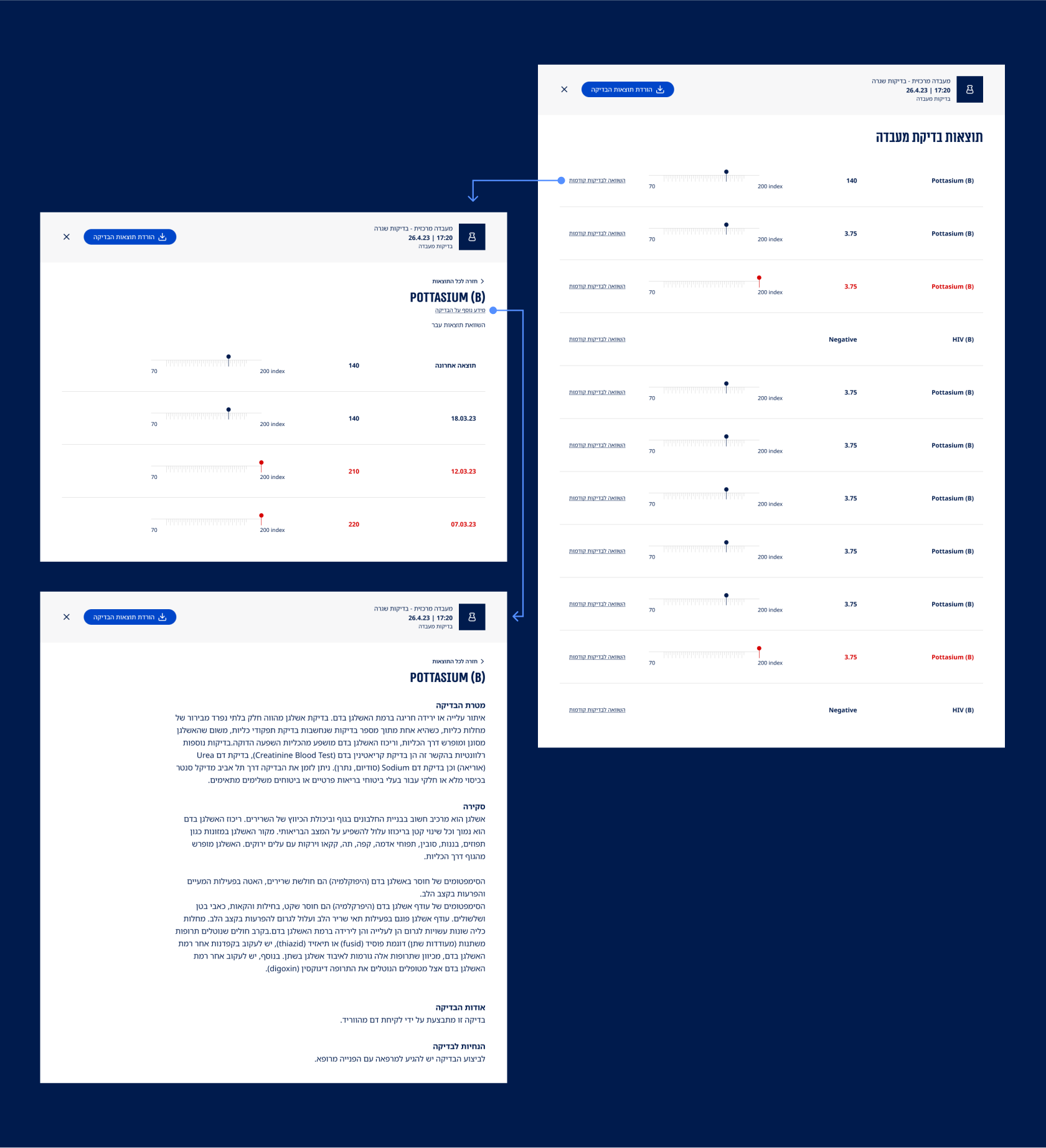
Lab Test Results
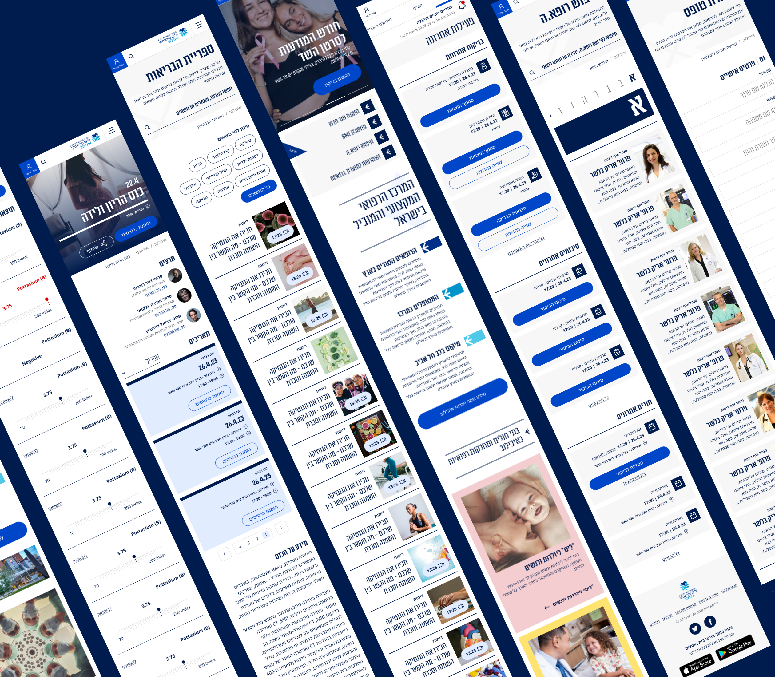
Mobile Responsive Design
The style guide includes foundational website components with adapted colors for each medical main unit. The component library covers all existing elements, addressing edge cases and unique scenarios, ensuring visual consistency and adaptability for a polished user experience.
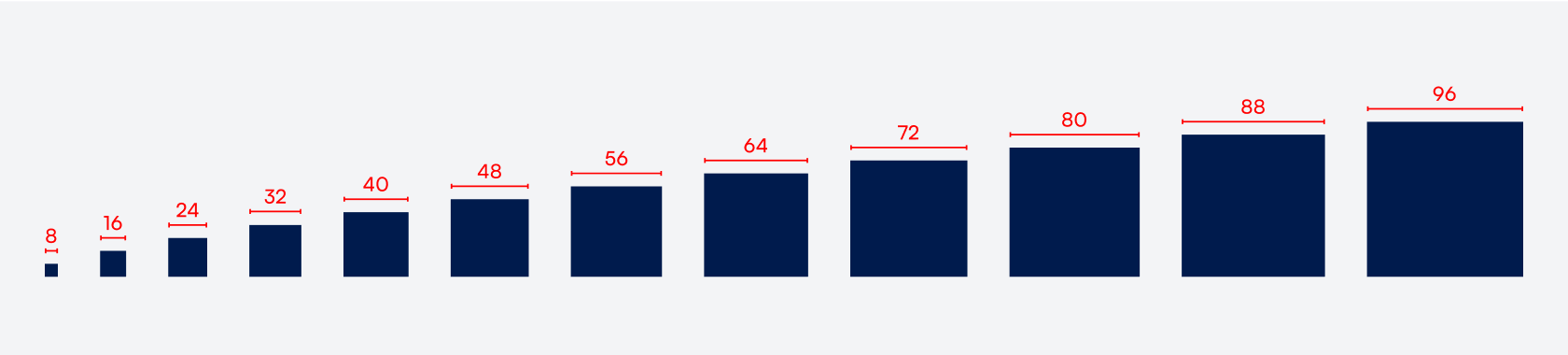
8 Point Grid System
Using the 8-point grid system provides a visual hierarchy to elements and ensures consistent scalability with fewer decisions to make while maintaining a quality rhythm. When designing the UI, it looks clean, better, and harmonious.
" The team at uniqui led us at Ichilov through every stage on our way to a new website - starting with a thorough study of the health and medical field, through in-depth research, data analysis, shaping the graphic concept, and up to the complete designed website, and worked closely with the development team. The result is excellent, always with professionalism, creativity, efficiency, and a great spirit at the highest levels! It was a pleasure! "

